Introduction:
Data is exploding at an unprecedented rate. While data continues to grow at an exponential rate, its true purpose becomes hazy and difficult to discern. Businesses should always figure a way to reshape that massive stream of data in and out of dependable and actionable insights that their decision-makers will use in an attempt to acquire a competitive edge in the industry. On a regular schedule, data scientists must analyze, perceive, and visualize large datasets. This is why it is critical that they have access to the appropriate data visualization tools.Today, we’ll learn about data visualization and the Top Data Science Tools that every data scientist should use on a daily basis.
What do you understand by data visualization?
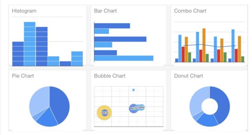
The procedures of a schematic diagram of data in the form of geographic maps, charts, sparklines, infographics, scatter plots, or numerical graphs are referred to as data visualization. Communication tools, in conjunction with data visualization, are user-friendly and usable when required to get out there and recognize patterns, anomalies, and patterns in data. In attempting to deal with modern data analysis prerequisites, the technique is extremely popular. Check out Data Science Online Training & Certification Course to get yourself certified in Data Science with industry-level skills.
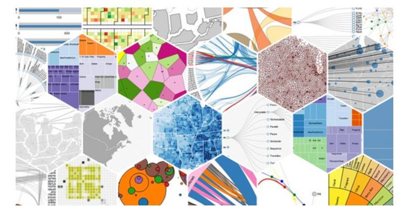
Data visualization tools not only assist in the creation of simple charts based on your data but also in the creation of interactive charts. Charts Interactive Charts, as the name implies, are interactive charts. We have a variety of data visualization tools that assist in quickly spotting, some of which are listed below:
Top Data Visualization tools-
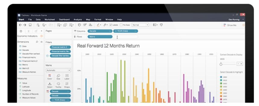
- TABLEAU:
There are several detailed BI and data visualization tools that support a variety of options. Tableau is one of them. Over 57,000 businesses use its interactive visualization solutions, giving advanced database integrations. Tableau is well-known for its drag-and-drop user interface. Some basic versions of this data visualization tool are free. It also accepts data in a variety of formats, including xls, CSV, XML, and database connections. Tableau allows you to create dashboards and worksheets with interactive charts and graphs. The user-friendly data visualization tool also comes with a variety of data import options.
Learning how to use Tableau takes time and practice, although there are plenty of resources available to assist you.
- QlikView:
QlikView is more than just a data visualization tool; it’s a data discovery platform that helps users make better decisions faster by speeding up analytics, uncovering actionable business insights, and improving the accuracy of results. QlikView is a potent decision-making BI tool once again. It is simple to configure and deploy. It is scalable and has few RAM constraints. The visual drill-down is the favourite feature of Qlik view. If you want to learn more about QlikView, go to the official website of QlikView.
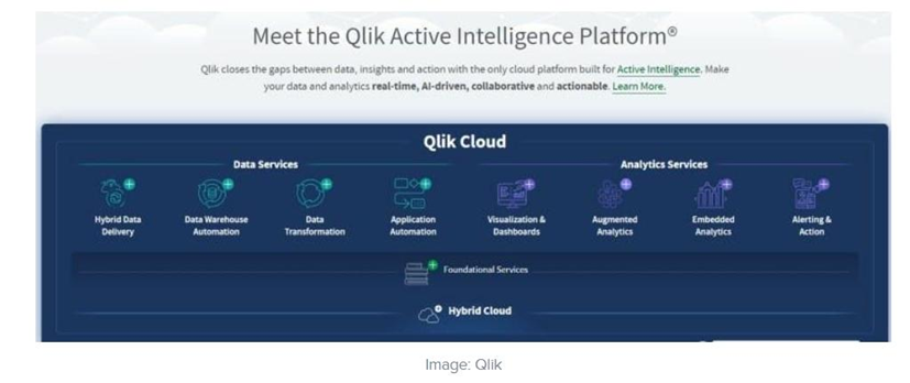
For many years, it’s been an instinctive software development kit which has been used in organizations all over the world. It can combine a variety of data sources with colour-coded tables, bar graphs, line graphs, pie charts, and sliders to create visualizations. It was built using a “drag and drop” visualization interface that allows users to quickly add data from a variety of sources, including databases and spreadsheets.
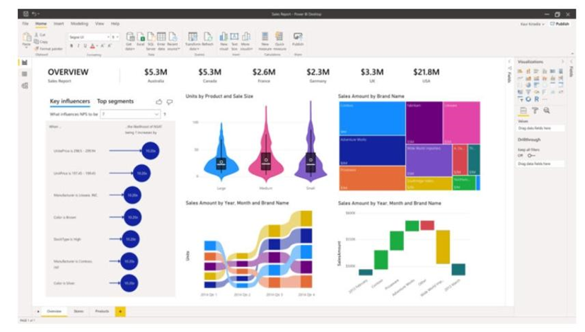
- Microsoft Power BI:
Power BI is an analytics and visualization tool created by Microsoft, the tech behemoth. It connects to over 100 different data sources, allowing users to create customized dashboards and detailed reports. On the dashboard, Power BI also provides real-time updates. It also gives users a platform to generate reports and share information with others in their company. It serves as a centralized repository for all of your company’s data, accessible to all of your employees.
Because Microsoft Power BI cannot be integrated with other systems, it can only be used as a standalone BI tool. Power BI offers many software connectors and services, as well as an easy-to-use hybrid configuration, and is obtainable in both free and paid tiers. The reports generated can be shared within the organization as a result of these integrations, making it a very useful tool for businesses.
- Dundas BI:
Dundas BI provides highly customizable data visualizations such as interactive scorecards, maps, test equipment, and charts, making it easier to create ad-hoc multi-page reports. Dundas BI simplifies the complex process of cleansing, visually inspecting, transforming, and modeling large datasets by giving users complete control over visual elements.
It can be integrated into any website or used as an organization’s central data portal. The data visualization tool, which is based on responsive HTML5 technology, allows users to connect, analyze, and communicate with their own data on any device. Dundas BI has a lot of advantages. For example, it has a lot of flexibility.
A wide range of data sources and graphs
A large number of built-in features for trying to extract, show, and modify data are available.
- Datawrapper:
Datawrapper is a data visualization tool available online that can be used in a variety of situations. It has a simple and intuitive user interface that makes it very easy to use. The Datawrapper Data Visualization tool’s best feature. You shouldn’t have to know how to code to do this. It’s a simple game with only a few clicks. Hence It’s one of the most user-friendly data science visualization tools for beginners.
Besides uploading data files to Datawrapper, people can create charts and maps directly in the browser. The reader should be able to view the charts and maps formed in Datawrapper on any device they are using because they are able to respond and are designed for all types of devices. It only allows you to upload 500 rows of data and one sheet (or 5MB) of data at a time, for example.
- Infogram:
Infogram is a drag-and-drop visualization and graphical representations platform that is available on the web. It enables users to quickly record and share digital charts, infographics, and maps, even if they have no prior design experience. Infogram is indeed accessible as a WordPress plugin, which makes embedding visualizations in WordPress-based sites even easier. Both free and paid versions of the visualization tool – Pro, Business, Team, and Enterprise – are available.
A WYSIWYG editor is included in the data visualization tool, which transforms user data into infographics that can be embedded, published, and shared.
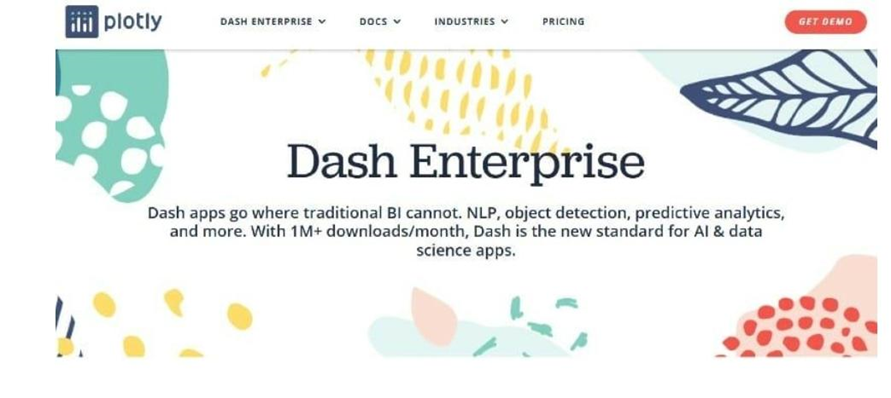
- Plotly:
Plotly graphs are engaging and also have a unique URL, making them simple to share. Besides floating over data points and continuously scanning them, readers can learn more about how you made them. Plotly is an open-source data visualization tool that integrates fully with analytics-focused programming languages such as Matlab, Python, and R, allowing for complex visualizations. Plotly supports both on-premise and cloud deployment and is widely used for joint effort, distributing, changing, creating, and being able to share interactive, graphical data.
Rather than trying to decode your code, readers can start exploring all of the data interactively, making it ideal for sharing both engaging plots and datasets with your viewer. Whenever it comes to data visualization software, there are a lot of options. Plotly is a name that everyone remembers. It is based on the d3.js framework. It has a more user-friendly interface in Python, R, and Matlab.
- Sisence:
Sisense, recognized as one of the most adaptable data visualization tools, provides users with real-time data analytics from any location, at any time. The best-in-class visualization tool will help decision-makers start making data-driven decisions by identifying key patterns in data and summarizing statistics. It does have a powerful yet simple and straightforward interface that lets you drag and drop data onto the canvas and create visualizations with just a few mouse clicks.
Sisense makes use of Big Data-optimized multi-dimensional in-memory technology. It also includes an artificial intelligence motor with predictive modeling, allowing you to quickly visualize data trends and uncover hidden patterns.
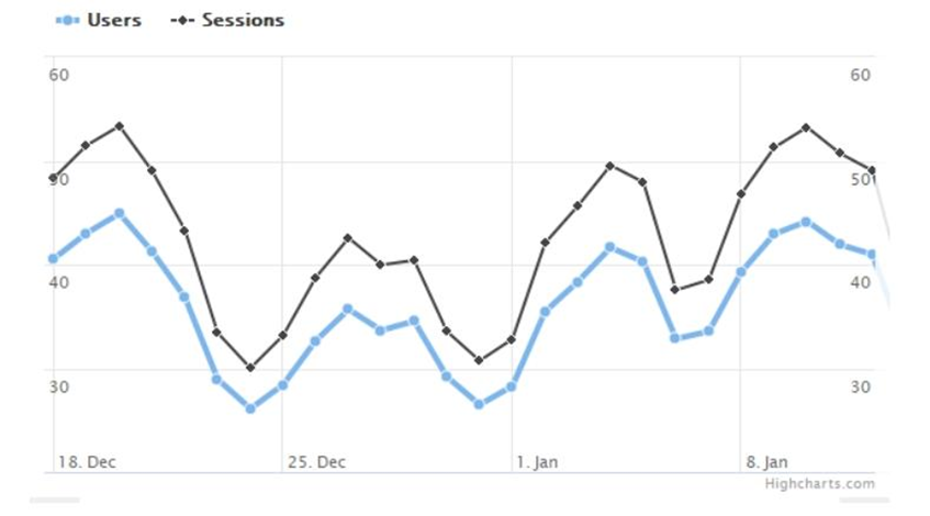
- HighCharts:
HighCharts is amongst the most popular web-based charting applications. This is partly due to the fact that it requires less effort to use than other JS-based charting libraries. Furthermore, it is a well-established JavaScript library with a high level of compatibility. The Highcharts tool, which is used by 72 of the world’s top hundred companies, is ideal for visualizing streaming big data analytics. Highcharts, which is based on the Javascript API and integrates with jQuery, supports cross-browser functionality for easy access to interactive visualizations.
HighCharts, which is written in JavaScript, is a simple way to add interactive charts to a web app or website. Supposedly based on SVG, the JavaScript charting library has canvas and VML fallbacks to support older browsers.
- Excel:
In Excel, you can visualize data in a variety of ways. One of them is to use scatter plots, which show the relationship between different datasets that you want to compare. Users also see how distinct variables are linked to one another to determine whether or not they are connected.
Microsoft Excel would be a data visualization tool with a user-friendly interface, so it isn’t difficult to use. For market research or financial planning, many data analysts use scatter plots to analyze statistical, scientific, medical, and economic data.
- D3.js:
The D3 library is a javascript library. It’s a free and open-source programme. The Document Object Model can be used to bind arbitrary data. It’s an open-source library, so it’s free to use. D3.js is a JavaScript library that makes it easier to visualize data using CSS, HTML, and SVG. D3 stands for Data-Driven Documents, which is an interesting acronym. As a result, it’s possible to create dynamic, interactive data visualizations in web browsers.
D3 combines powerful visualization components, data-driven DOM deception methods, graphics calculation, and layout algorithms into one package. Although some knowledge of JavaScript is required to use D3.js, there are apps like Ember Charts, NVD3, and Plotly’s Chart Studio, which allow non-programmers to stand to gain from the famous JS library.
- JupyteR:
JupyteR, a web-based application, is one of the most popular data visualization tools, allowing users to create and share documents with visualizations, equations, narrative text, and live code. Data cleansing and transformation, statistical modeling, simulation analysis, immersive computing, and machine learning are all possible with JupyteR.
- Google Charts:
Google Charts, which is coded in SVG and HTML5 and can produce graphical and pictorial data visualizations, is one of the major players in the data visualization market. Zooming is possible with Google Charts, and it has unrivaled cross-platform suitability with iOS, Android, and even older versions of the Internet Explorer browser.
Conclusion:
Fortune Business Insights estimated the data visualization market to be worth $8.85 billion in 2019. With a compound annual rate of 10.2 percent, the market is expected to be worth $19.20 billion by 2027. Due to the exponential growth of data and information, there is no shortage of data visualization tools. It is, however, critical to choose one that is suitable for your needs.
They can use data visualization tools and knowledge gained from an industry-recognized academic institution to land better jobs and advance their careers. And data scientists must learn and keep up with all of the latest data visualization tools; only by mastering this art will they be able to keep up with the fast-paced world of big data and AI and ML.
Author Bio
Archit Gupta is a Digital Marketer, and a passionate writer, who is working with MindMajix, a top global online training provider. He also holds in-depth knowledge of IT and demanding technologies such as Business Intelligence, Salesforce, Cybersecurity, Software Testing, QA, Data analytics, Project Management and ERP tools, etc.
TechAroundNow is a blogging website that centers on the latest technology and marketing innovations and trends, aimed at assisting individuals and businesses across the globe since 2021. TechAroundNow continues to serve as a reliable source for staying up-to-date with the ever-evolving landscape of technology and marketing, ultimately fostering growth and success in the digital era.